Hillary Clinton Logo for 2016 Presidential Campaign Riles Up Internet
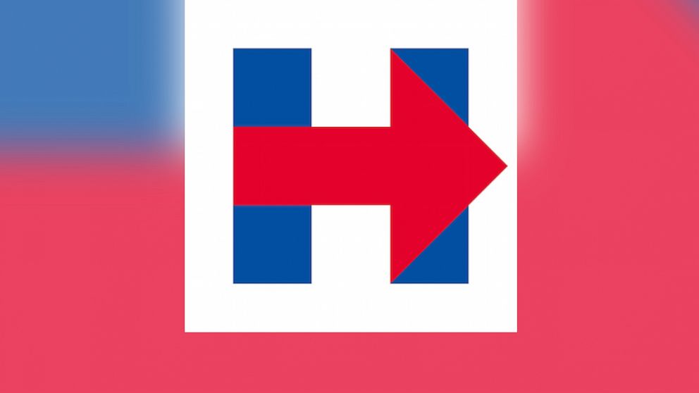
— -- Hillary Clinton made her "big announcement" on Sunday in a pre-recorded video, but what's got people riled up on the Internet is the new logo for her 2016 presidential campaign.
Twitter users have quite the strong feelings about the flat-designed blue "H" with a red arrow running across left to right, and they're not holding back.
Here are some of Twitter's most hilarious reactions.
Clinton's new logo is giving people a lot of déjà vu. While Wikileaks outright accused Clinton of stealing their "innovative" Twitter logo design, other users are seeing similarities between Clinton's logo and FedEx, Iceland's flag, the "History" channel and even hospital roadway signs.
And users want to know: What's the logo symbolize? Why's the arrow pointing to the right?
While some people feel the arrow is reaching out to right-wing Americans, this guy is seeing a connection to Tinder.
Regardless of what message the logo was meant to send across, others just outright hate how it looks aesthetically. And unfortunately for Clinton, people are not sugarcoating their dissing.
Visual communication scholar Keith Kennery told ABC News today one explanation for the strong reactions to the logo is that people respond first to their senses -- what they can see, hear, smell, taste and touch.
"That's why it's very important to have a good logo, because people have instant responses and feelings about what they see in their environment" said Kennery, who teaches at the University of South Carolina and is working on a book called "Philosophy for Media Theory" coming out next year. "Symbols are more basic, foundational and fundamental than any written and spoken language. We're hardwired to respond to what we see."
Kennery said if he had to improve the logo, he'd redesign it from scratch. the red arrow is one of the logo's main problems, he added.
"Red is a symbol for danger, and the campaign has a big and bold red arrow pointing right to the right that's dominating the whole logo," he said. "I don’t know if the public wants that. The logo also looks industrial with all the hard edges of the rectangles and arrow. It just doesn't have a warm, fuzzy, welcoming feel."
Clinton's campaign team did not immediately respond to ABC News' calls and email requesting comment.


